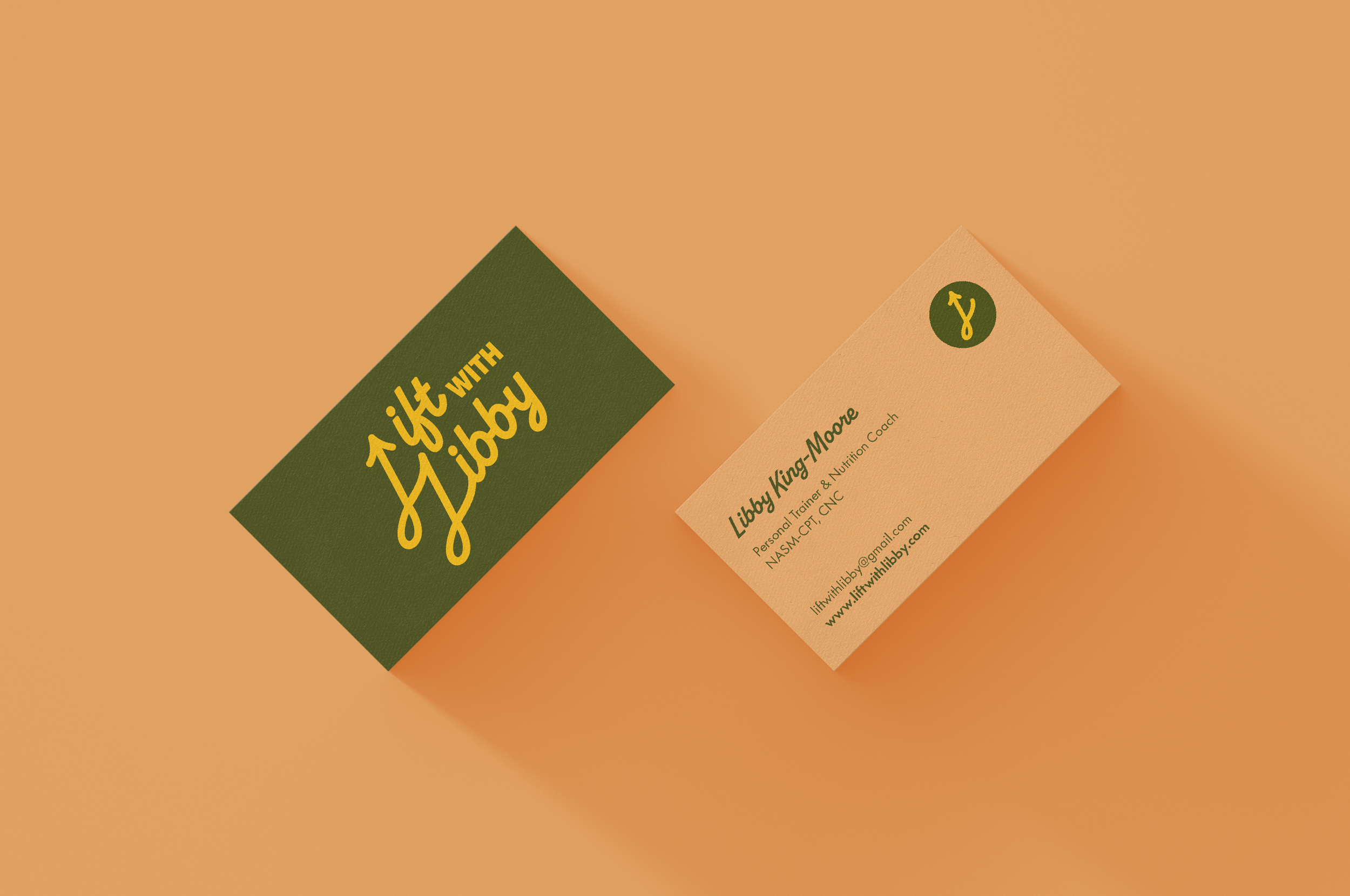
Lift with Libby
Lift with Libby’s goal: Rewrite the script on strength training. Libby needed a logo that pushed back on the dark, intimidating look of most strength training logos, while not feeling too delicate and soft. Orso rooted the logo in the following values:
Lift: For Libby, everything is rooted in lifting. Not just lifting weights. Lift as a way to approach training and fitness: uplifting yourself and others to grow a pea pod from the little seeds you planted.
Energy: Energy is about more than just calories and macros. With Libby, energy means excitement and joy in anything you pursue. Life should be a joyous dance, filled with passion and excitement for movement.
Warm: Warming up is essential to strength training. But warming should be a feeling that lasts beyond a workout. Warm should be a feeling you get through being wholeheartedly welcomed and seen for what your body and soul can do.
Logo
Brand Guide
Business Cards
“We wanted warm and energetic colors because not only am I personally over the intense, dark color of generic fitness, but also because we wanted to imbue the logo with a warm feeling you get through being wholeheartedly welcomed and seen for what your body and soul can do. Kari also created an arrow in perpetual motion to show that the path to strength isn’t always linear, but with passion and support, you will always achieve ‘lift’.”


