Joy of Coding
The Joy of Coding was born from the passion of one University of Michigan professor who was frustrated by the unequal access to coding education for high schoolers. Always one to take things into his own hands and create change, professor Raj Nadakuditi launched an online crash course for high schoolers to take during the summer. Since launching, the class has helped high school students across the country get exposure to coding, regardless of their prior experience or interest in a STEM career. While the growth and interest has been exciting, it also led to some growing pains:
Joy of Coding needed a clear brand identity that created an appearance distinct from the University of Michigan brand, while also showing the course is affiliated with the University (which is an important selling point for parents).
Its brand identity needed to better reflect the excitement and fun of coding. It needed to attract people of all interest levels, so shouldn’t feel like your average tech-forward, sans serif coder vibe.
Joy of Coding needed to not only look young, fresh, and ‘hip with the youths’ who would be taking the course, but also professional and serious to the parents who would be signing off on their child’s application.
I was able to craft a fun, energetic brand identity for Joy of Coding, while clarifying the course offering and purpose through its messaging.
Joy of Coding Brand Identity Scope:
Logo, typography & color
Website design
Illustration
Social templates
Logo Variants
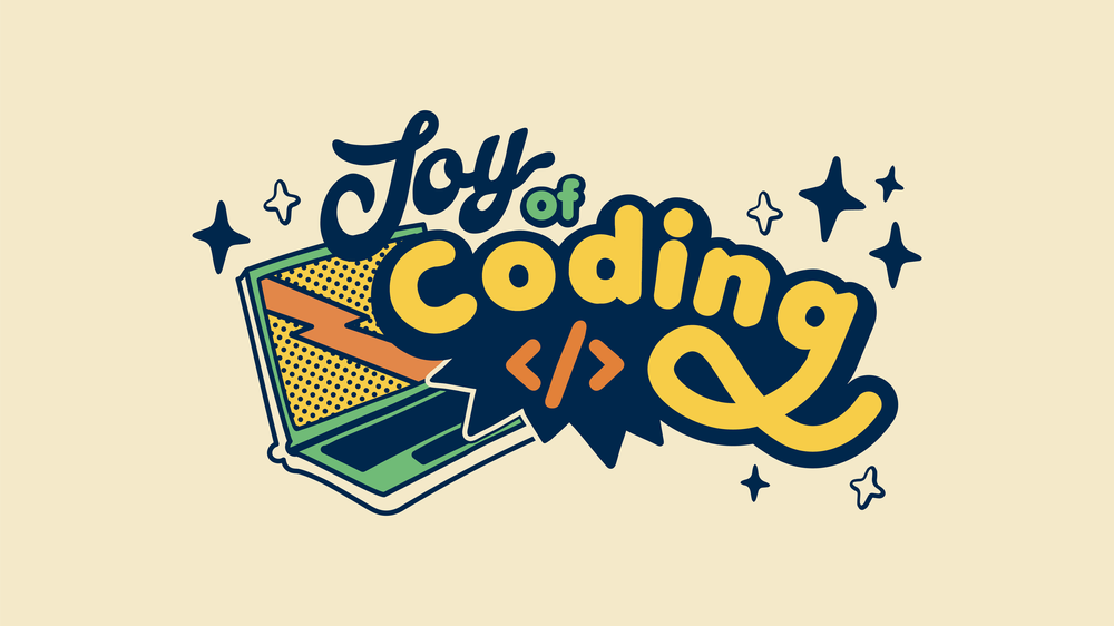
Joy of Coding’s logo is a custom type design that combines the whimsical feel of a script font with the clean look of a sans serif.
Color Palette and Typography
The brand color palette pulls in yellow and navy colors reminiscent of University of Michigan’s iconic ‘maize and blue.’ The palette is a bright, cheerful array of primary colors with a retro, muted feel.
The typeface brings in a friendly, fun charm thanks to Aesthet Nova, a chunky display type with soft corners designed by Mariya Pigoulevskaya of the Northern Block. This is paired with accents of Lakeside, an unassuming script font designed by Mark Simonson.
Social Media Graphics
Illustrations
I created a suite of hand-drawn illustrations to use on t-shirts and other marketing collateral showing where the Joy of Coding students were based.
Website
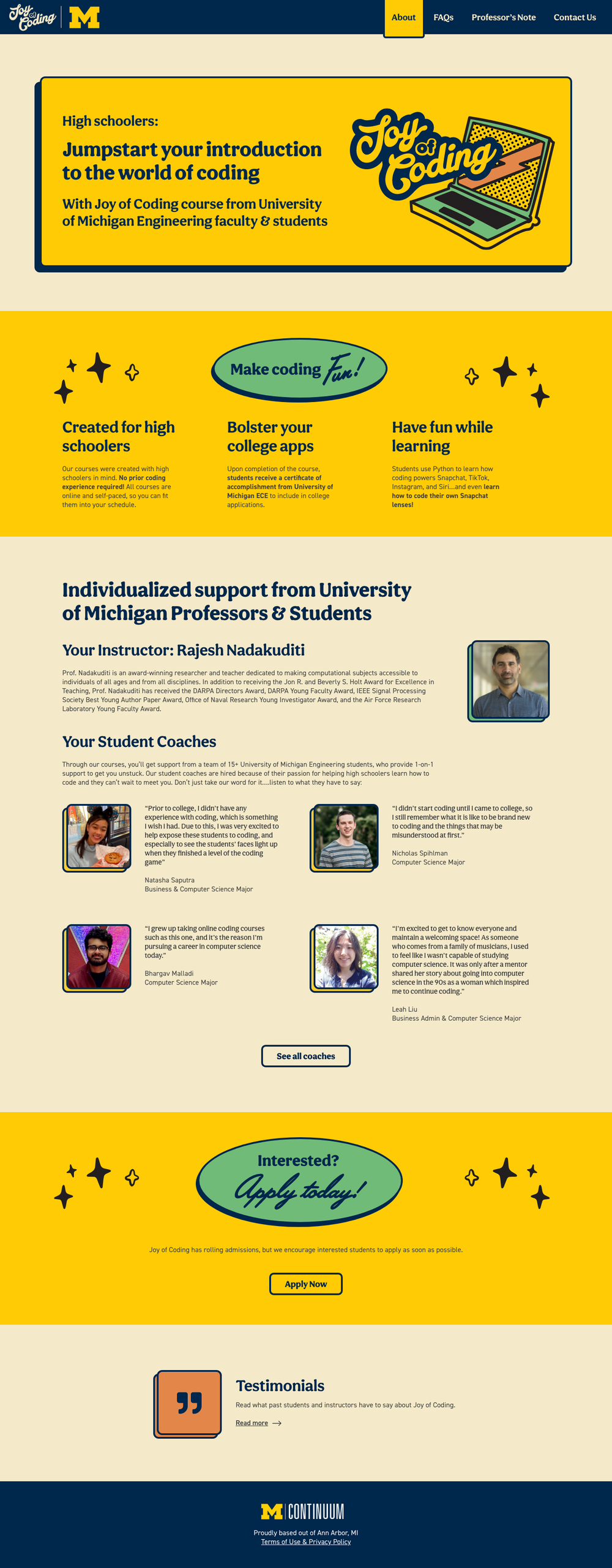
Starting with just a flyer of content, I created mobile and desktop website designs that would be colorful and fun, while echoing University of Michigan’s site architecture and blue/yellow theme to build brand equity.


