Darrin for Senate
Darrin Camilleri and his staff approached me as they prepared to launch a campaign for Michigan State Senate. Darrin had successfully represented Michigan’s 23rd House District for three terms, advancing big wins in infrastructure and education. As the son of an immigrant from Malta and a Latina, he became Michigan’s youngest Latino and first-ever Maltese-American elected to the Legislature in 2016. Coming from a long line of union auto workers, he has been steadfast in his pursuit of opportunity for all communities in Michigan. Now with freshly redrawn district maps, Darrin eagerly put his name in the ring for a Senate campaign.
The Approach
Darrin’s existing logo was outdated and wasn’t rooted in a specific strategy. He needed a new logo that was bold, fresh, and reflected his values. Through a brand discovery session, we established what the brand should and shouldn’t be.
Darrin’s Brand Should: Feel innovative and on-trend, yet accessible and friendly. It should show a visual association with the democratic party. It should be timeless and last through more than just this Senate race.
Darrin’s Brand Shouldn’t: Rely on overly-used trends or iconography. It shouldn’t feel like every other logo in the logo soup of Michigan’s political campaign yard signs.
Next, we dug into the competitive landscape to get a sense for what political campaign branding looks like in Michigan. Where are the opportunities for differentiation? After researching dem and republican US and State House and Senate logos from recent elections, we were able to see some state and national trends. Most notably? A lot of blue, a lot of Michigan mittens, and a lot of stars.
After discussing our Discovery findings, we set out to help Darrin’s campaign create a visual identity that aligned with its vision and mission.
The Solution
Logo
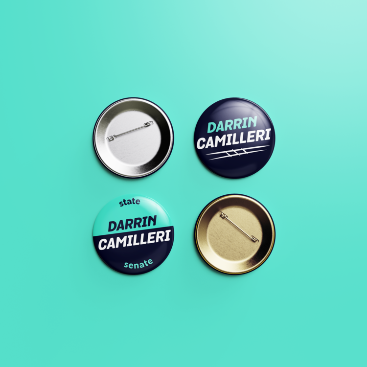
The Darrin for Senate logo came together from two different concepts. First, the word mark was crafted to evoke forward momentum and boldness amidst uphill battles. Second, the Train Tracks Swoosh logo mark was created, inspired by an initiative Darrin is proudest of: working across the aisle to pass an infrastructure overhaul to fund the urgently-needed Allen Road rail crossing in Woodhaven. The Train Tracks Swoosh is meant to both underscore the logo with a sense of urgency, as well as give a subtle nod to Darrin’s local celebrity status as “the train guy”.
Typography
Darrin for State Senate’s brand typography pairs the friendly, modern look of Zeitung Pro with the energetic, optimistic look of Museo Sans for a type system that aligns with the brand’s strategy.
Color Palette
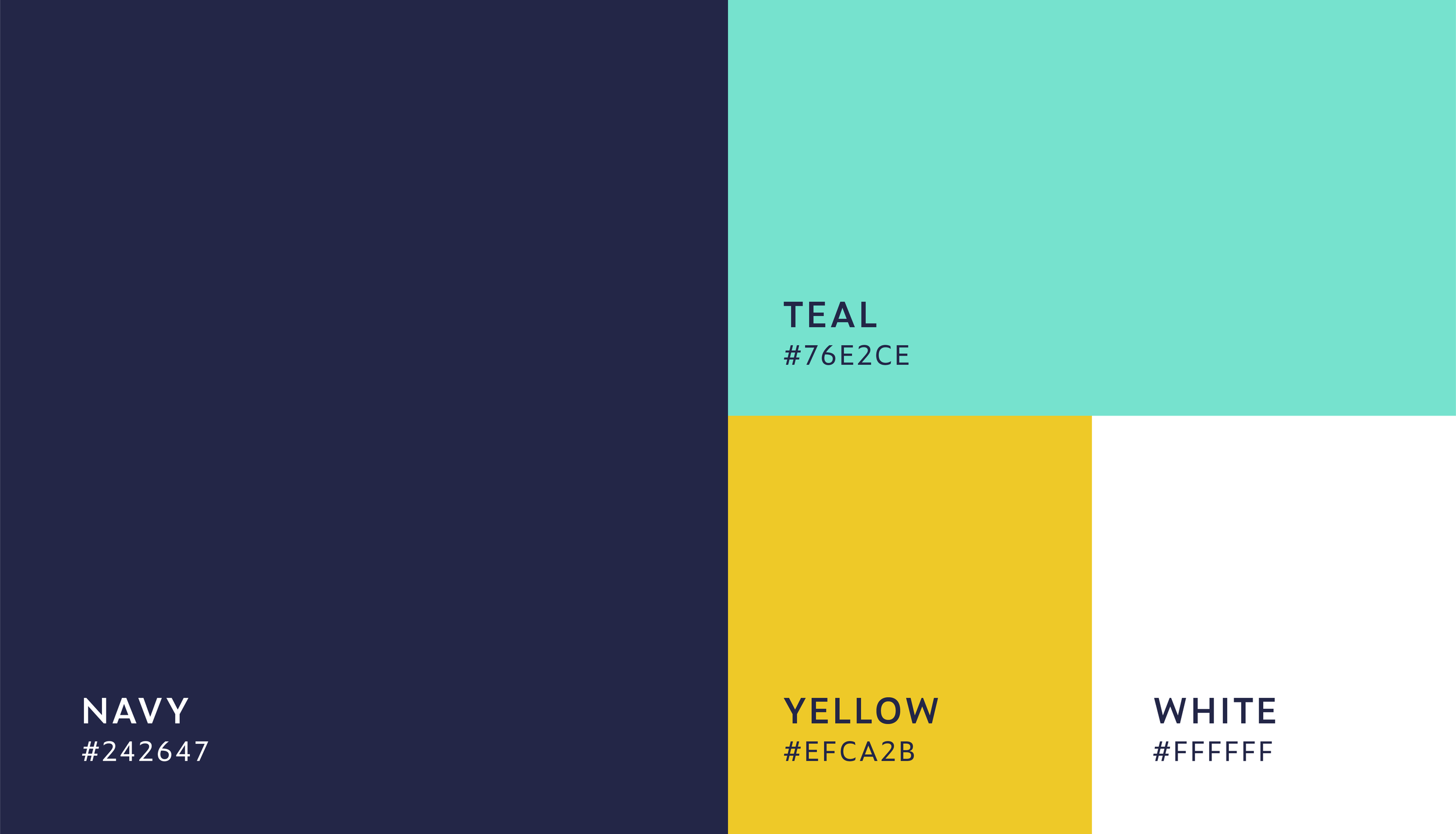
The colors were inspired by vintage car ads from the Motor City, with a timeless navy blue and teal.
Web & Digital Design
We transitioned Darrin’s existing website to the new brand, applying all brand styles across the entire site.


