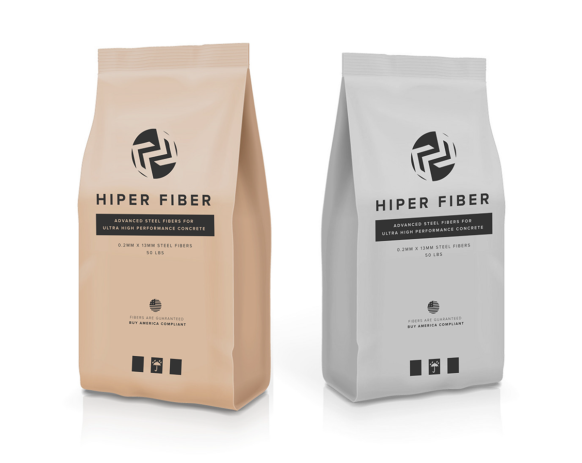
HiPer Fiber
HiPer Fiber believes infrastructure like roads and bridges should be built to last and accessible for all. The team came to me craving a sleek, sophisticated brand design evocative of Apple or Nike’s simple yet powerful look. I took its existing logo and academic language and transformed it into a bold verbal and visual brand ready to support the company’s transition into major markets.
Brand Message Framework
Informed by stakeholder interviews, I crafted the following brand language:
Vision: We believe that infrastructure should be built to last and less expensive to maintain over time.
Mission: Our mission is to produce the highest quality, affordable steel fibers optimized for use in Ultra High Performance Concrete. The first of its kind, these innovative, sustainable fibers are specifically designed for UHPC and 100% made in the US.
Core Values: Innovation, High-Performance, and Accessibility.
Logo & Visual Brand
The visual brand style is grounded in boldness and simplicity, pulling from a palette of earthy metals with a pop of bright orange color. The threaded chevrons in the logo design were inspired by the weaving, angled steel fibers that HiPer Fiber innovated.


